Back to Insights
 6 MIN READ
Designing dashboards people actually use
How we decide which numbers earn a place on the first screen, and which ones stay in a report.
One number, one decision
Most dashboards fail because they are a tour of the database. Every chart the team could query is on the first screen, and none of them tell a person what to do before lunch. We start from the decision. What will someone change if this number moves?
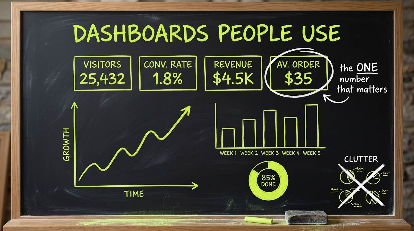
On a recent workshop wall we circled a single figure, average order value, and crossed out the rest of the clutter. Not because the other charts were false. Because they were not the number that person was hired to move. The first screen gets one job. Everything else has to argue its way on.

If a chart does not change what someone does tomorrow, it does not belong on the first screen.
What earns the first screen
A number earns its place when three things are true. A named person looks at it on a cadence. They know what “bad” looks like without a meeting. And there is an action they can take inside the product, not a request they have to email to someone else.
- One primary figure, labelled in the user’s words.
- The comparison that makes it meaningful: yesterday, target, or cohort.
- The action next to it, not in a tooltip.
- A quiet empty state for the day the data is not there yet.
What we move to a report
Trend lines, breakdowns, and the chart a board asks for once a quarter are real. They are not the morning screen. We put them one click away, with the same definitions, so the first screen and the report cannot disagree. A dashboard that invents a second meaning for “revenue” will be abandoned the first time finance joins the call.
We also refuse decorative gauges. A ring that restates a number the label already gives is not insight. It is furniture. If the only reason a visual exists is that the layout looked empty, we tighten the layout.
How we review it
Before launch we sit with the person who will use it and ask them to do yesterday’s job on the new screen. If they leave to open a spreadsheet, the dashboard has not replaced the spreadsheet. We would rather ship three numbers they trust than twelve they screenshot and ignore.
“The first screen is a decision, not a gallery. The rest of the data can wait its turn.”Victoria Hayes, Project Manager
Get the next build note
in your inbox.
One practical email a month. No fluff, unsubscribe anytime.
Keep reading
All insights